Videos:
1) Julia's Intro
2) art funding scream
3) bump up the 8 with Carven
4) give me more....funding
Tuesday, December 1, 2009
Monday, November 30, 2009
Art Funding Cuts finale.
Final Review
VIVO INTERNSHIP
VIVO INTERNSHIP
My outcome from this internship has been very positive. I have learned how to be more self-directed and to see things from a business side. Kika (from VIVO) decided to treat me as if I was pitching this idea to her as she wanted me to get a real-life feel and also have me leave with something for my portfolio. I have learned not to just rely on the client`s input, but also on my own judgement as I cannot be spoon-fed everything. I feel this has been a very valuable experience as it was a taste of what`s to come in the future of my career. I feel that when you leave school you may not be fully prepared for your actual job. Do you really know what to expect or how things will or will not work in the real world?
I feel that I can now call Kika a peer and someone I can consider a “Connection”. She is someone I would love to work for in the future as well.
I ended up taking on a solo project that taught me how to self direct what I wanted to do and then have Kika treat it like it was a pitch towards her. It started with t-shirt designs about the BC Art Funding cuts, but then progressed into documentation to make an interesting “youtube” worthy video that would become popular yet with a political message about our funding cuts. I am planning to pursue this further after this DIVA course has ended. I found I was working more alone than anything else besides Kika’s guidance. I did talk to some people who came to view the art pieces at VIVO but besides that I seemed to be on my own.
I originally assumed I would be helping with the Signal and Noise show, but ended up just being more on my own. I learned to be more disciplined with time frames and figured out my limits as a person and what I could do when given the space and freedom. I was basically spoon-fed since high school and through Langara. This was the first time I have actually had the chance to think on my own and do something.
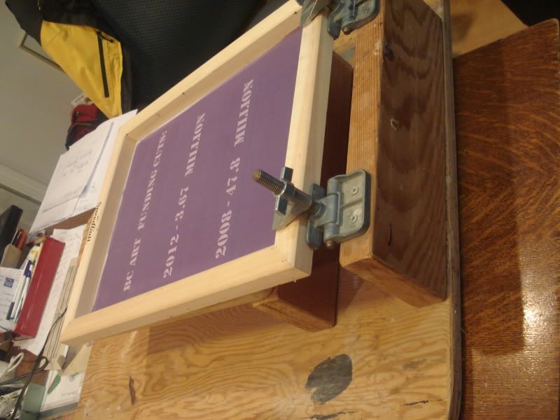
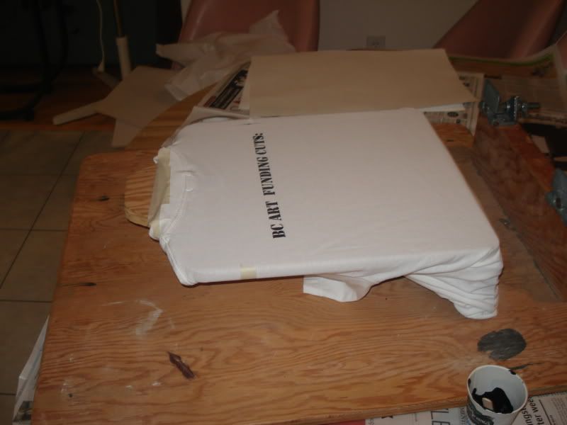
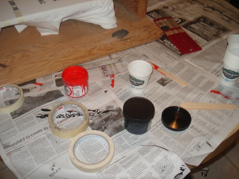
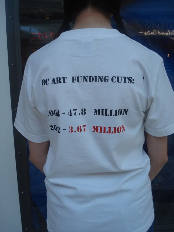
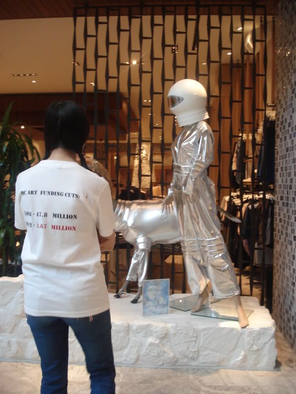
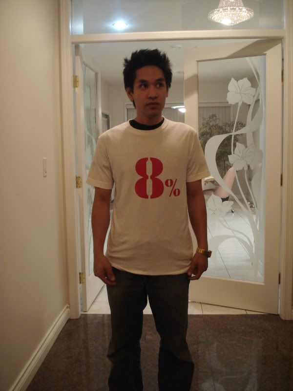
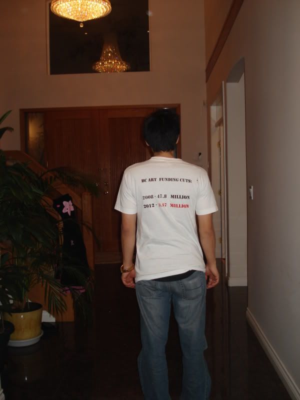
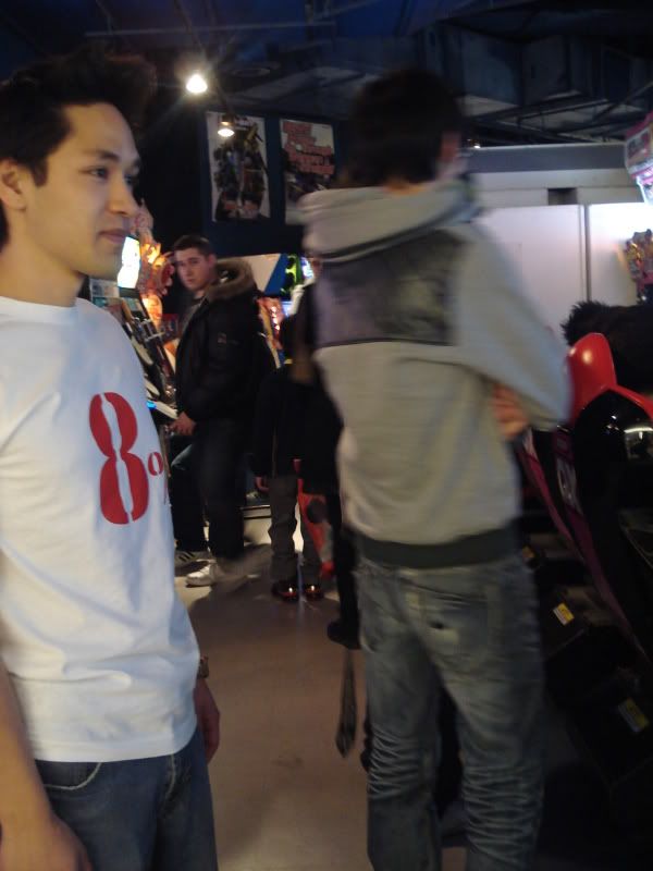
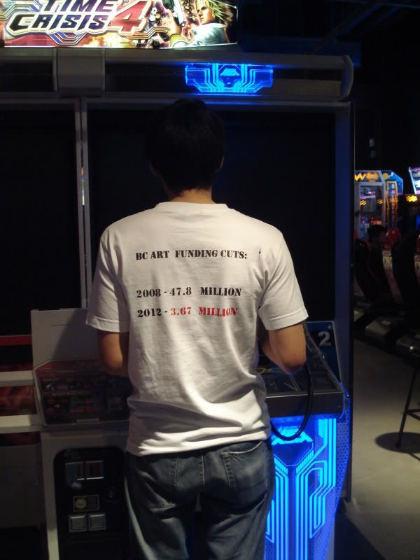
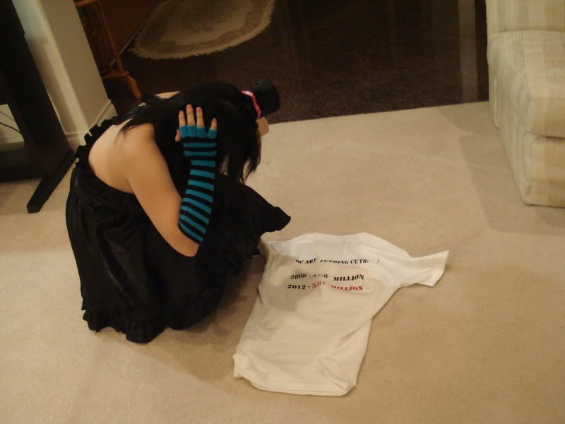
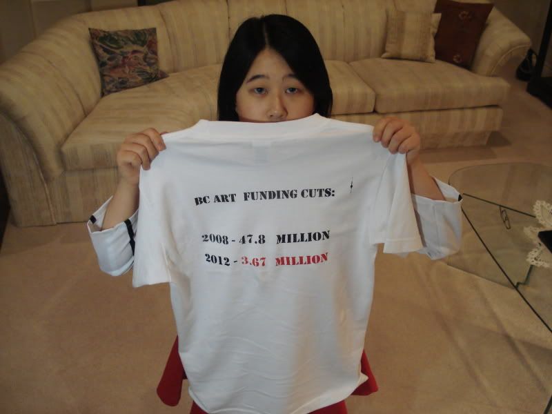
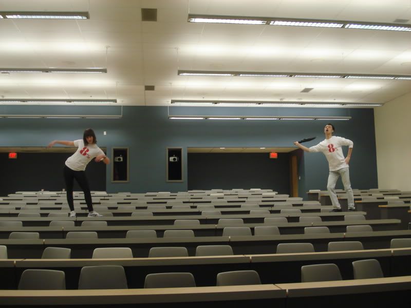
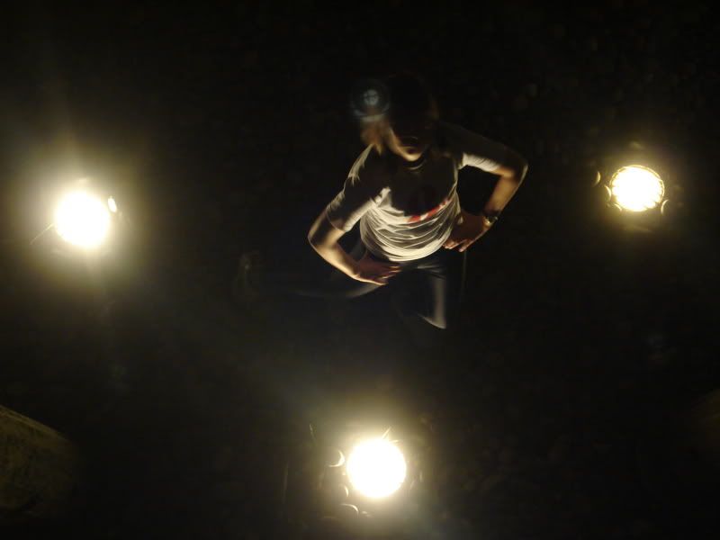
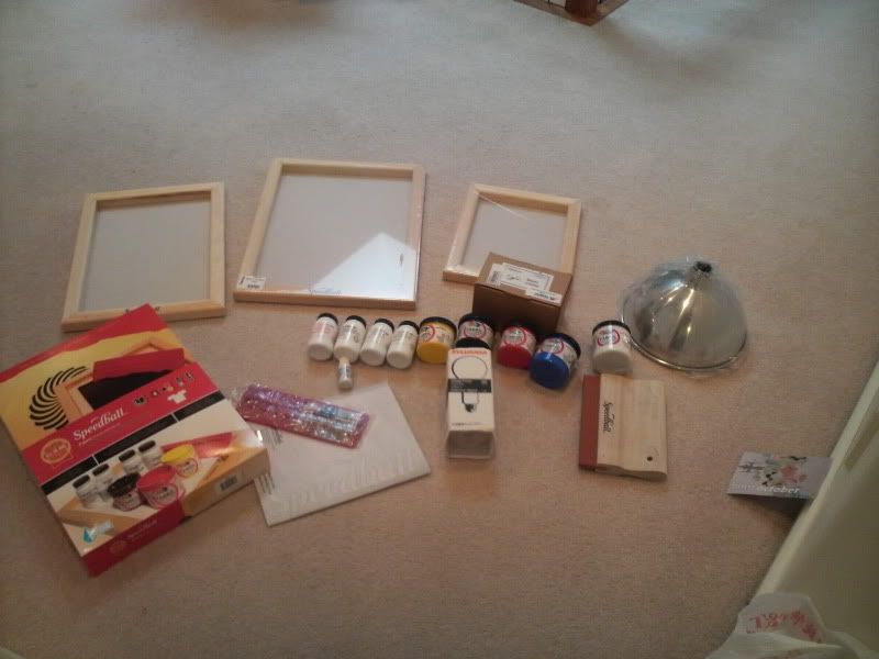
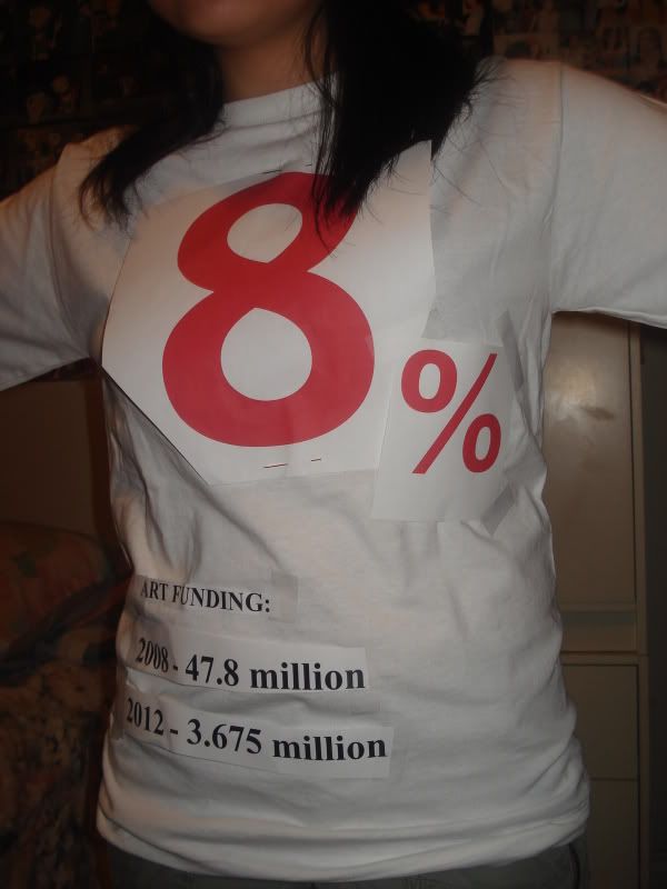
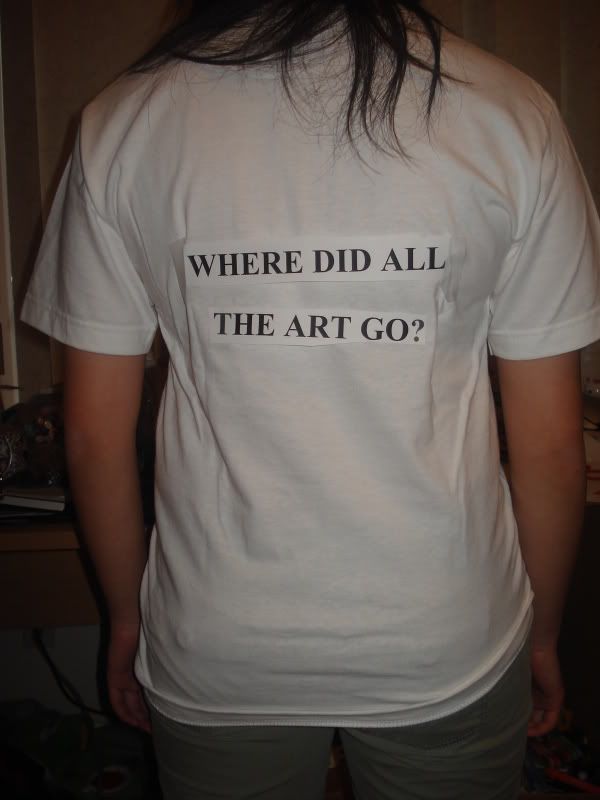
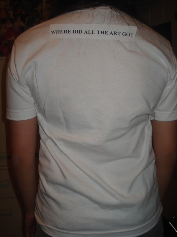
So I have made t-shirts to go with the Art Funding Cuts! I had to do a lot of learning from the screen-printing process as it was very difficult to make a “do-it-yourself” kit for home use. DO NOT BUY IT. The final product in my opinion turned out great and Kika loves it! I did some picture taking and some filming for the shirt as promotion. Each photo session was done in different scenarios to point out how the funding cuts will affect BC. I am going to be taking this further and re-shooting and photographing with better equipment. This is just a basic look at what I plan to do in the future. I am currently video –editting the videos to make a full length version. I have uploaded small unedited clips on youtube that are random.
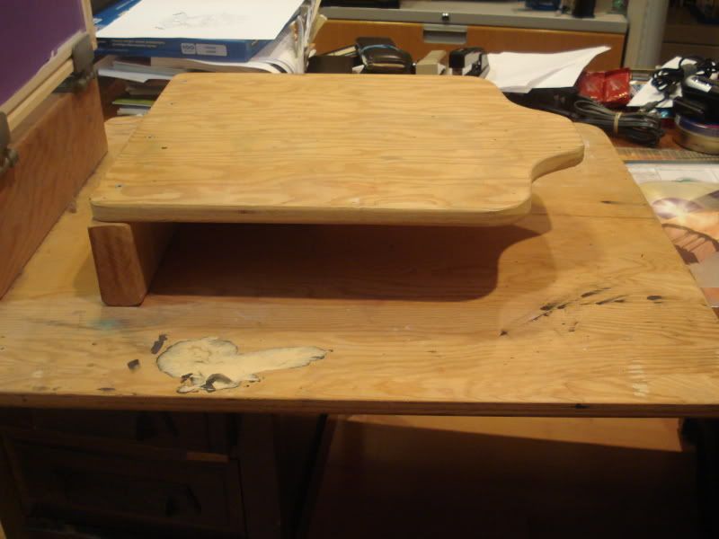
-PROCESS-
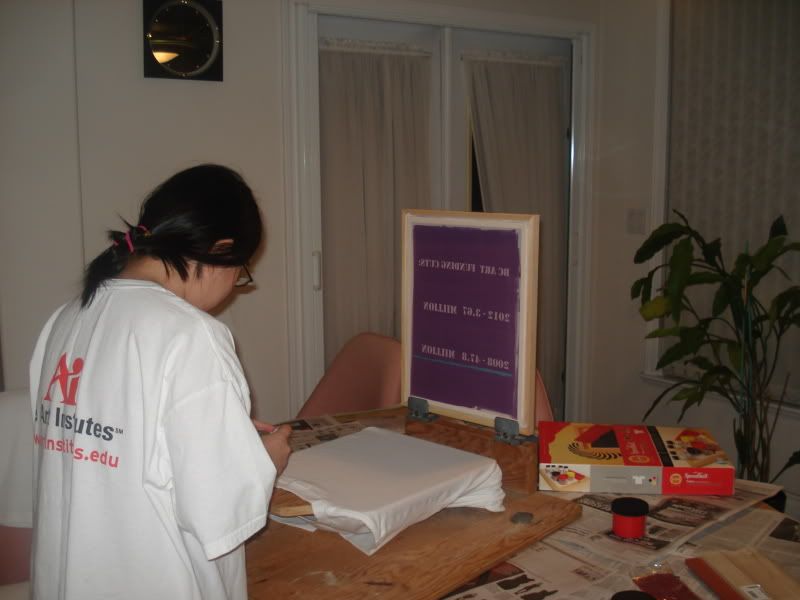
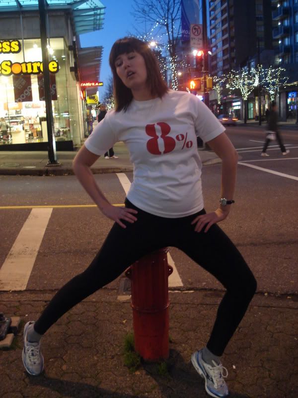
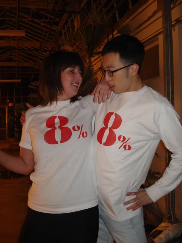
-MODEL 1- Sheila Wong
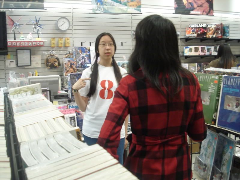
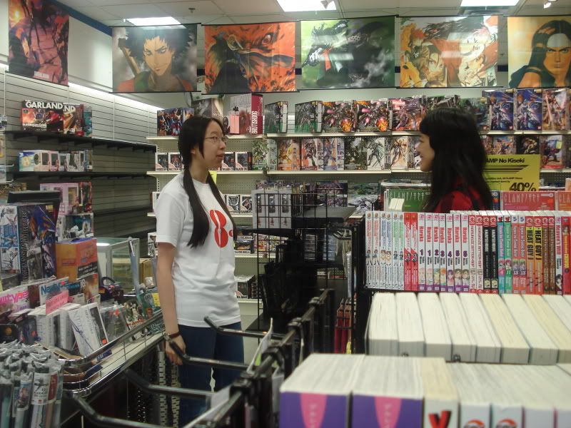
-MODEL 2- Jeremy Malins
-MODEL 3- Sachi Komori
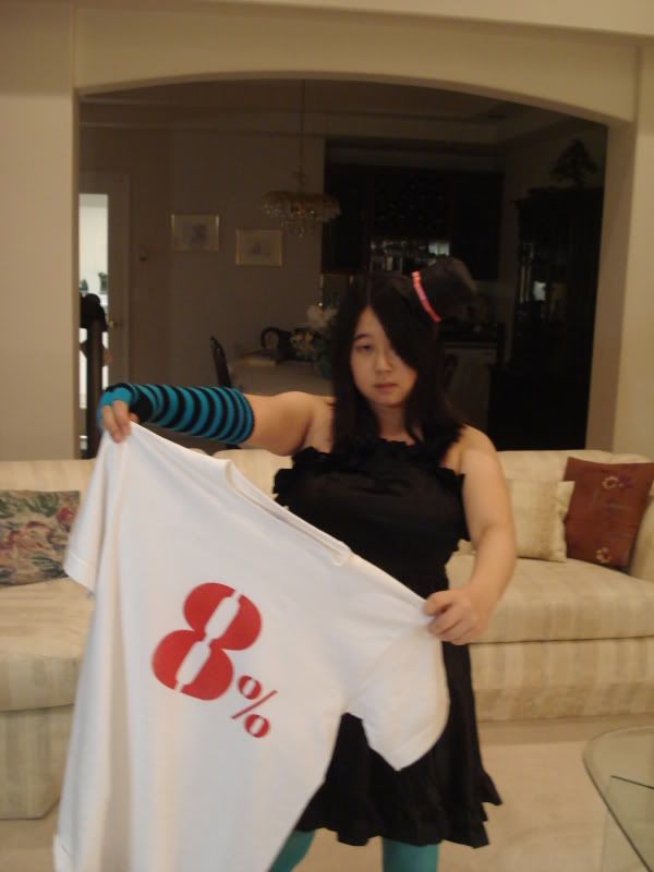
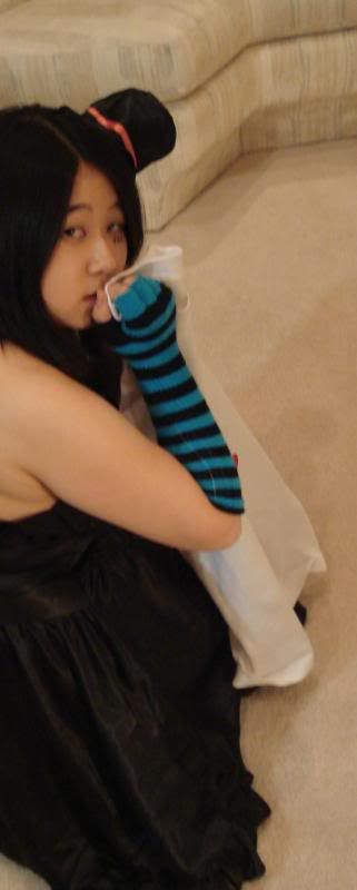
-MODEL 4 and 5- Julia Pfeifer and Carven Li
Monday, November 23, 2009
Critical response + more :D
Critical Response to Interactive Futures 09
Sachi Komori
Ruben Moller Code 3D
Ruben Moller’s “Code 3D” presentation was very captivating. He was very easy to listen to and it felt quite relaxed to hear him speak. Before showing his 3D film “Chaos”, there was some technical difficulties in getting it to play. He pulled it off rather smoothly as he humoured the audience while it was being fixed. The visual showed what appeared to be a dark substance, very thick and it had a weird almost corroded texture to it. It oozed about the screen until forming into a tree of skeletal-like hands. It seemed to be the opposite of what one might consider a “tree of life”. The hands started to rip at each other while very creepy audio effects were played. Some of which were easy to decipher such as creaking door hinges. The audio was really distracting at first as it was too loud, so the presentation was halted momentarily to have the audio reduced. It definitely set a very eerie and chilling mood to the visual which was already reeking of anti-life. It was like giving birth to the already deceased and having them fight for the nutrients (ie: the more branches or hands that there are, the less food/life will be distributed to each limb). It felt like a fight for a second chance at life after death.
He discusses his approaches to creating films. One quote that was very striking was, “The best movies are those with limitations” and that “rules are codes”. That is something that can only be said from experience. He moves on to discuss when creating 3D films what to take into consideration when it comes to the viewers (aka the audience). The comfort of the audience is very important as that will determine their overall feelings towards the work. Some steps to take are considering moving the images back. By this, they mean that if the image is popping too far out and too close to your face, it is too close for comfort. So the image itself will be pushed back towards the screen instead of further out towards the viewer’s face.
His explanation of what to take into consideration with the depth can be related to the new 3D televisions being released and how they decided to go about projecting their images. They are not popping out in your face, they are more so pushed back, but a sense of depth can be felt. Unlike Moller’s presentation, these new televisions require no use of any 3D glasses. One can simply sit in the comfort of their home and watch television with a new depth. Mitsubishi is currently demoing their televisions at exhibitions.
Works Cited:
Moller, Ruben. "Code 3D." Interactive Futures 09. Emily Carr University of Art and Design. Vancouver. November 20th 2009.
-------------------------------------------------------------------------------------------
If you're interested in the 3D tv..follow this link, it also shows you how they do it and also what you'd see ..they show u a pretty good representation.
http://www.engadget.com/2008/01/04/mitsubishi-shows-off-3d-tv-technology-no-glasses-needed/
Wednesday, November 4, 2009
Tuesday, November 3, 2009
SOWR midterm!
SOWR - VIVO - Midterm

Sachi Komori
Role:
Animateur or Gallery Attendant
Creating an effective image to get the message out about the BC art funding cuts
Kika is now helping me with this and is acting more like my employer.
Research:
Looking into funding cut statistics
How Quebec handled the "threat" (Anti-Tory campaigns)
Font research
What I've learned:
Quebec just created anti-tory campaigns that were shown on the net and on TV. Artists speaking out about it.
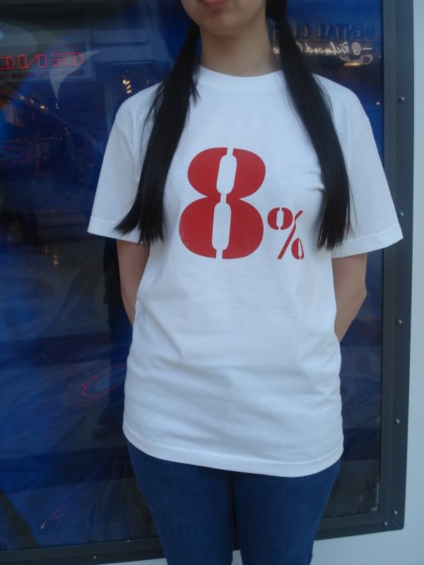
For font research, I've just begun this, but I am now learning where fonts came from, why they were created, such as what kind of message or point was trying to be made with the use of them and what I can use versus what I cannot(Copyright laws). Kika had me start looking through fonts to start looking to see similar shapes. The "8" in the t-shirt needed to have a matching % sign to go along with it and a lot of fonts do NOT match them up. This posed a lot of problems. Also, what do the fonts mean? What are their intended purpose? Some fonts are very circular so they can mimic the Olympic rings, but I'm not sure people would notice that about it. The font (Futura) was very plain and it didn't seem like the message we were getting out was very important.
Also that words when capitalized versus left in lower case make a big difference. Lots of problems came up with font picking along with this.
In Progress:
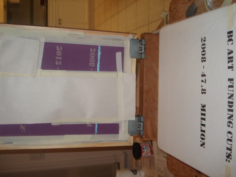
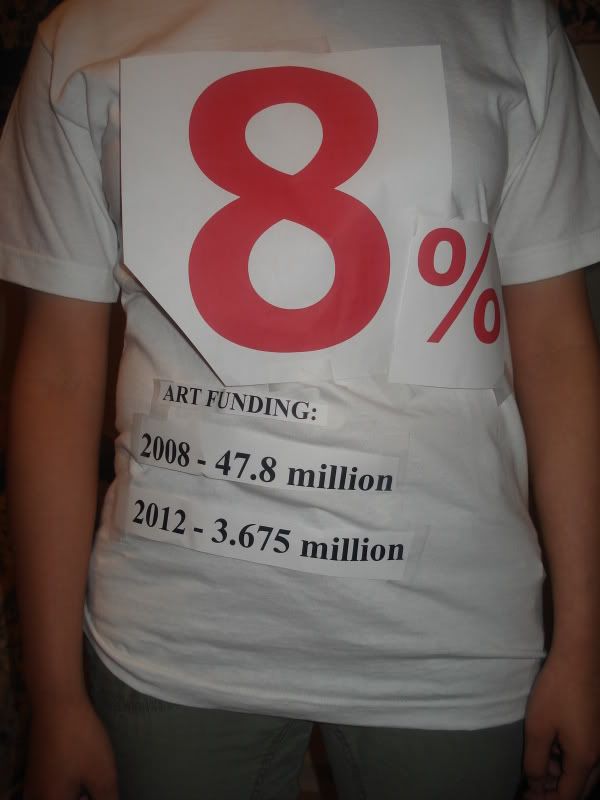
Picking the correct font for the shirt. We are settling possibly on one called STENCIL which was used on military and cargo shipments. We are now re-modelling the layout of the t-shirt as to where things will go.
Looks like it will be "8" in the front really big and a 1/4 size % sign. On the back it will say the statistics of
BC ART FUNDING:
2008 - 47.8 million
2012 - 3.67 million
We are working on changing the wording for "BC Art Funding". Also, we figure to go with STENCIL since the wording is all CAPITALS naturally, so there's no fiddling around with lower case/upper case.
Lower case looked better using futura, but the whole message seemed like it wasn't that important.
All capitals looked awkward and it made the word MILLION stand out in a way that seemed like we were still getting a lot of money. Making One capital per word also looked strange, so we decided to maybe stick with a font that was naturally all caps, saves any trouble.
8%
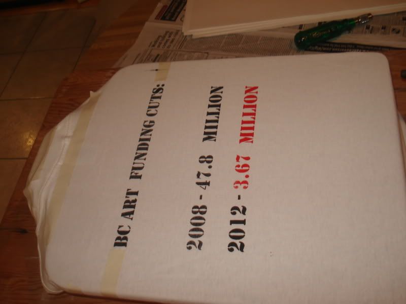
BC ART FUNDING:
2008 - 47.8 million
2012 - 3.67 million
Versus something written like this:
8 %
(two different fonts used. Arial for “8” and Dotum for the “%”. The Arial “%” doesn’t go well with the 8 according to Kika. Example:
8%
BC Art Funding:
2008 - 47.8 million
2012 - 3.67 million
bc art funding:
2008 - 47.8 million
2012 - 3.67 million
BC ART FUNDING:
2008 - 47.8 MILLION
2012 - 3.67 MILLION
Tuesday, September 29, 2009
Internship!
Sachi Komori - SOWR
Where:
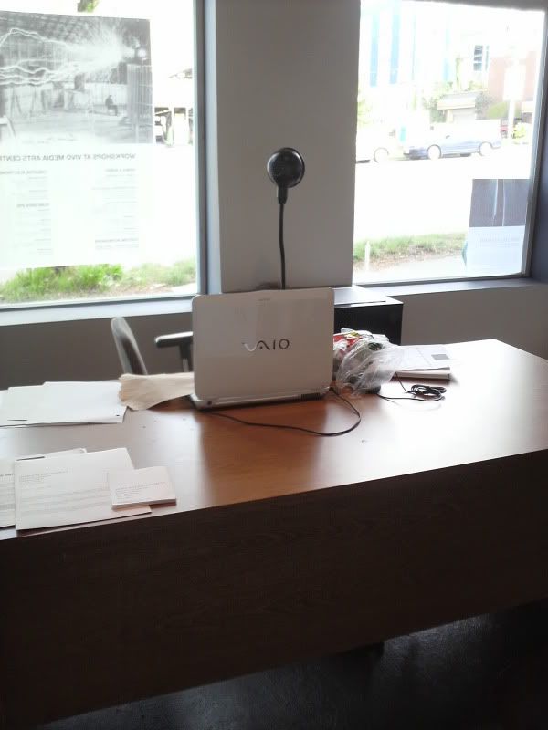
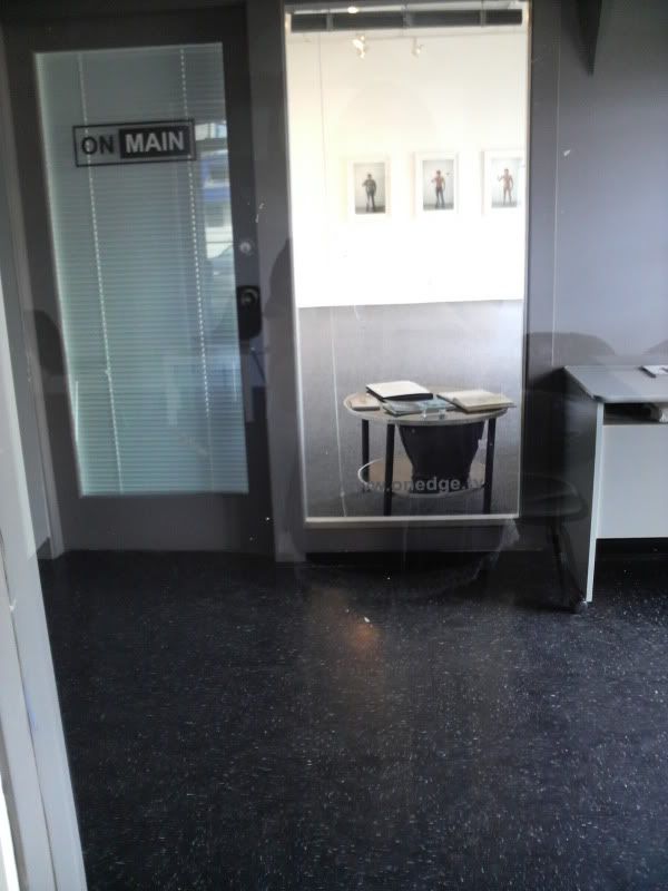
VIVO Media Arts Centre on Main Street in Vancouver
Intent:
I would like to hopefully gain some experience in working with other artists.
I’d like to also be able to create a visual work about an issue that VIVO is concerned with that speaks to people.
Role:
Stats:
We are getting an 85-92% funding cut.
2008/2009 - 47.8 million
2009/2010 - 42.219 million (as of February)
2009/2010 - 23.075 million (suddenly, as of September)
2010/2011 - 3.749 million (not including Gaming funds)
2011/2012 - 3.675 million (not including Gaming funds)
In Progress:
I am currently deciding whether to create apparel and/or posters or an animation. There are many pros and cons to either decision, as animations mean where I post it could affect how many or how few people actually view it. Youtube was a good idea, but it seems the average user of Youtube has a very short attention span and may not sit through it unless I can make it captivating or very quick. The flash animation may be a bit too ambitious at this point and I’m not sure if it’s even the best route to go about getting the message out there. Apparel was an idea since if even a few people wear it and use public transit, the message is out there and people can see it. The image itself is going to be something drawn that is only 8-15% completed. I may also photograph some art pieces and edit them out of photos to make a point of what we could be losing or not have had at all due to the funding cuts.
Subscribe to:
Posts (Atom)