SOWR - VIVO - Midterm

Sachi Komori
Role:
Animateur or Gallery Attendant
Creating an effective image to get the message out about the BC art funding cuts
Kika is now helping me with this and is acting more like my employer.
Research:
Looking into funding cut statistics
How Quebec handled the "threat" (Anti-Tory campaigns)
Font research
What I've learned:
Quebec just created anti-tory campaigns that were shown on the net and on TV. Artists speaking out about it.
For font research, I've just begun this, but I am now learning where fonts came from, why they were created, such as what kind of message or point was trying to be made with the use of them and what I can use versus what I cannot(Copyright laws). Kika had me start looking through fonts to start looking to see similar shapes. The "8" in the t-shirt needed to have a matching % sign to go along with it and a lot of fonts do NOT match them up. This posed a lot of problems. Also, what do the fonts mean? What are their intended purpose? Some fonts are very circular so they can mimic the Olympic rings, but I'm not sure people would notice that about it. The font (Futura) was very plain and it didn't seem like the message we were getting out was very important.
Also that words when capitalized versus left in lower case make a big difference. Lots of problems came up with font picking along with this.
In Progress:
Picking the correct font for the shirt. We are settling possibly on one called STENCIL which was used on military and cargo shipments. We are now re-modelling the layout of the t-shirt as to where things will go.
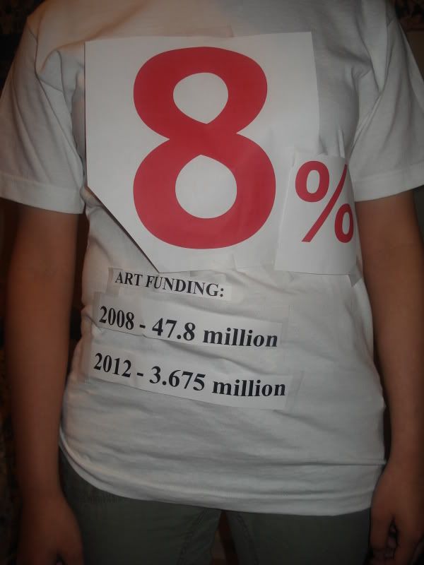
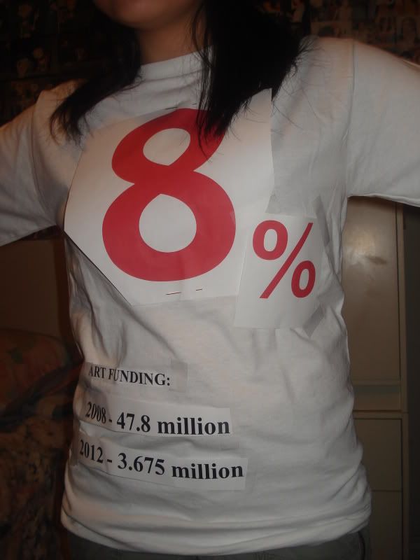
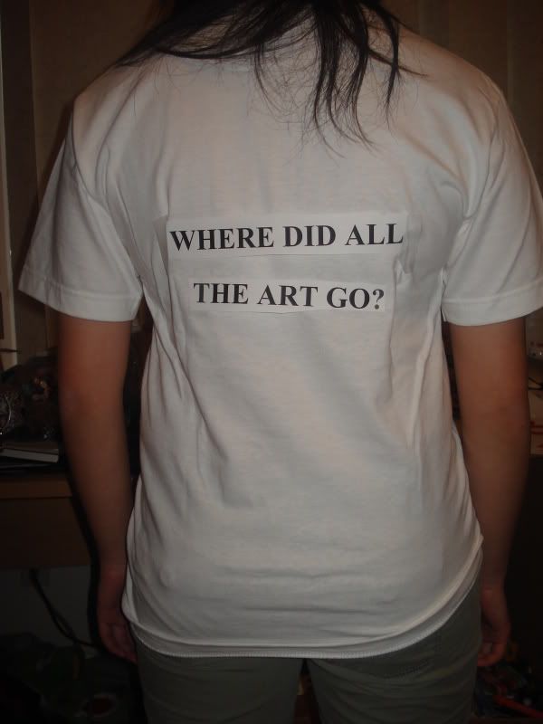
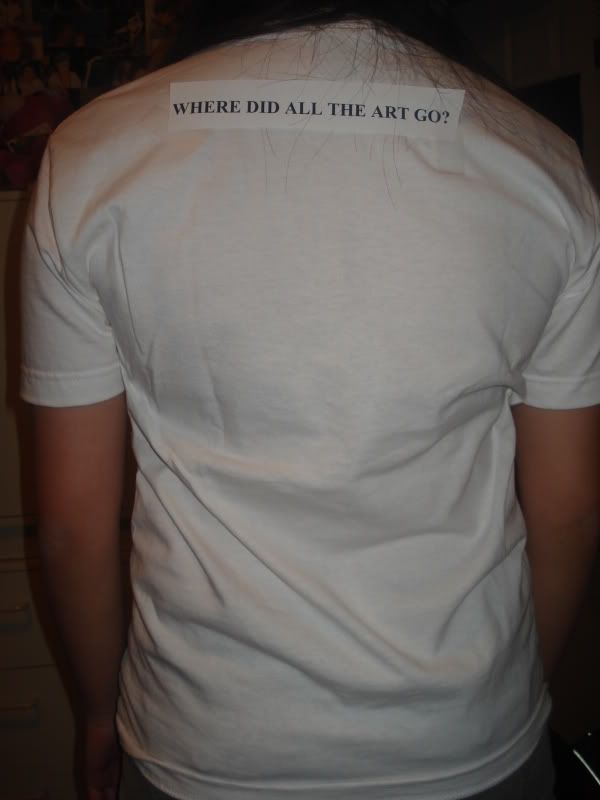
Looks like it will be "8" in the front really big and a 1/4 size % sign. On the back it will say the statistics of
BC ART FUNDING:
2008 - 47.8 million
2012 - 3.67 million
We are working on changing the wording for "BC Art Funding". Also, we figure to go with STENCIL since the wording is all CAPITALS naturally, so there's no fiddling around with lower case/upper case.
Lower case looked better using futura, but the whole message seemed like it wasn't that important.
All capitals looked awkward and it made the word MILLION stand out in a way that seemed like we were still getting a lot of money. Making One capital per word also looked strange, so we decided to maybe stick with a font that was naturally all caps, saves any trouble.
8%
BC ART FUNDING:
2008 - 47.8 million
2012 - 3.67 million
Versus something written like this:
8 %
(two different fonts used. Arial for “8” and Dotum for the “%”. The Arial “%” doesn’t go well with the 8 according to Kika. Example:
8%
BC Art Funding:
2008 - 47.8 million
2012 - 3.67 million
bc art funding:
2008 - 47.8 million
2012 - 3.67 million
BC ART FUNDING:
2008 - 47.8 MILLION
2012 - 3.67 MILLION
No comments:
Post a Comment